Healthy.io, 2022-2023
Building Healthy.io's first design system
Challenges
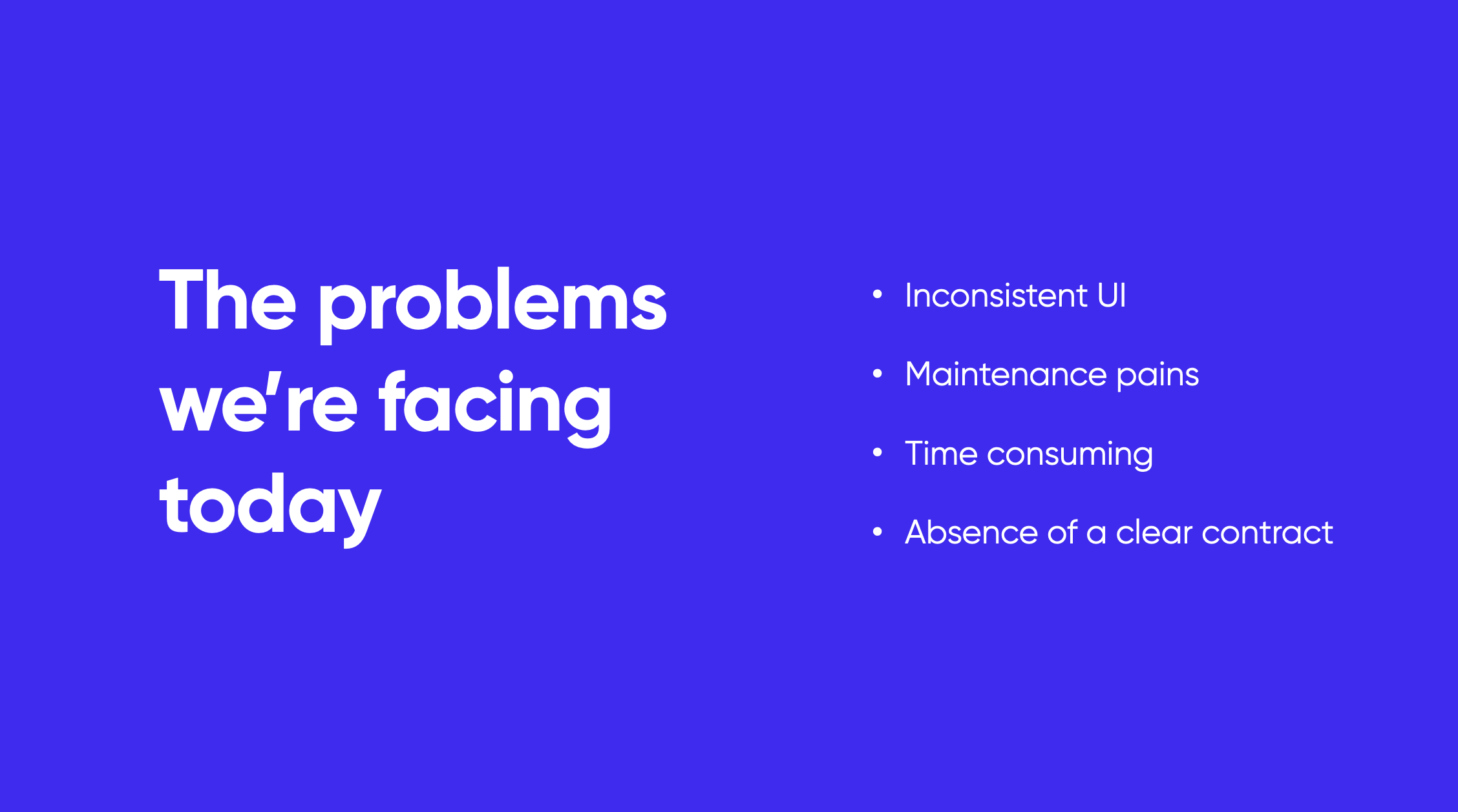
By 2022 Healthy.io had already developed and maintained a series of different products: 7 mobile apps (urine tests and wound care management) and 4 desktop-based tools and complex systems (Heart, Brain, Beat and Wound portal). Some were used internally and some customer facing.
Different maturity levels led to various UI patterns, lack of consistency and clear guidelines. While we all did our best to sync with each other it was time to create our first design system.
My role
As product design lead I was in charge of managing the collaborated effort of all the product designers from different task forces. My hands-on responsiblities here were mostly on the mobile side of our design system.
The process
Our mission included the following steps:
- Research - exploring other design systems, common practices and UX patterns and gathering our thoughts on the current state of each component across our products.
- Find "common ground" - weekly design meetings and semi-weekly syncs with the developers to get as much feedback and insights from everyone involved and find the most suited solutions to our systems and apps.
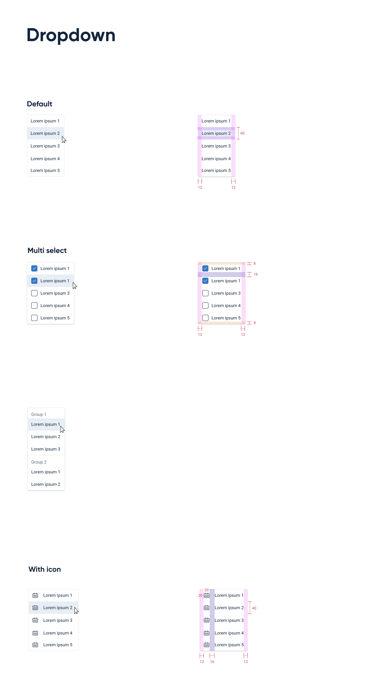
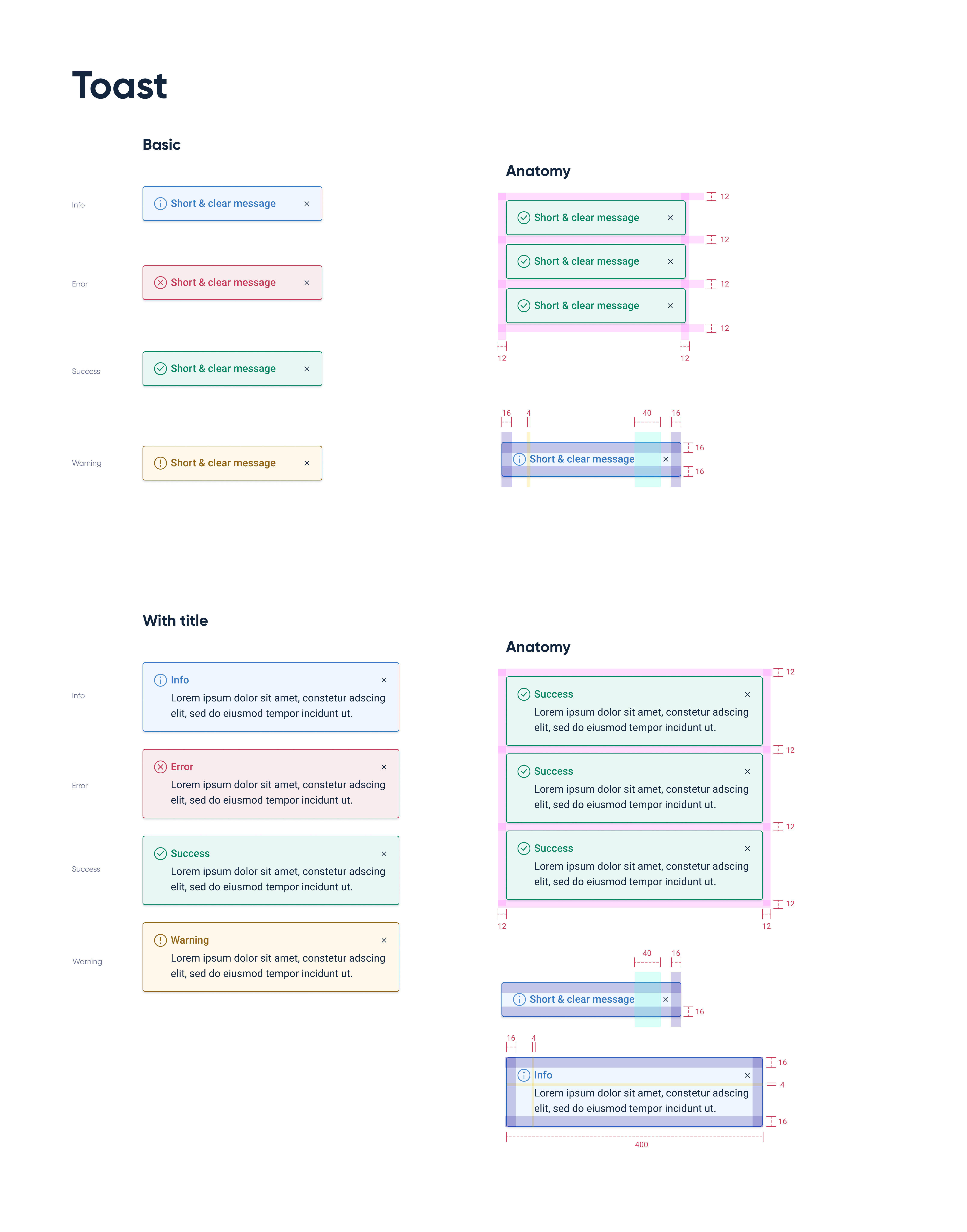
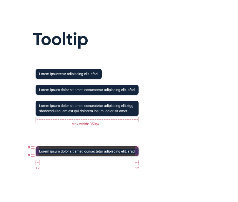
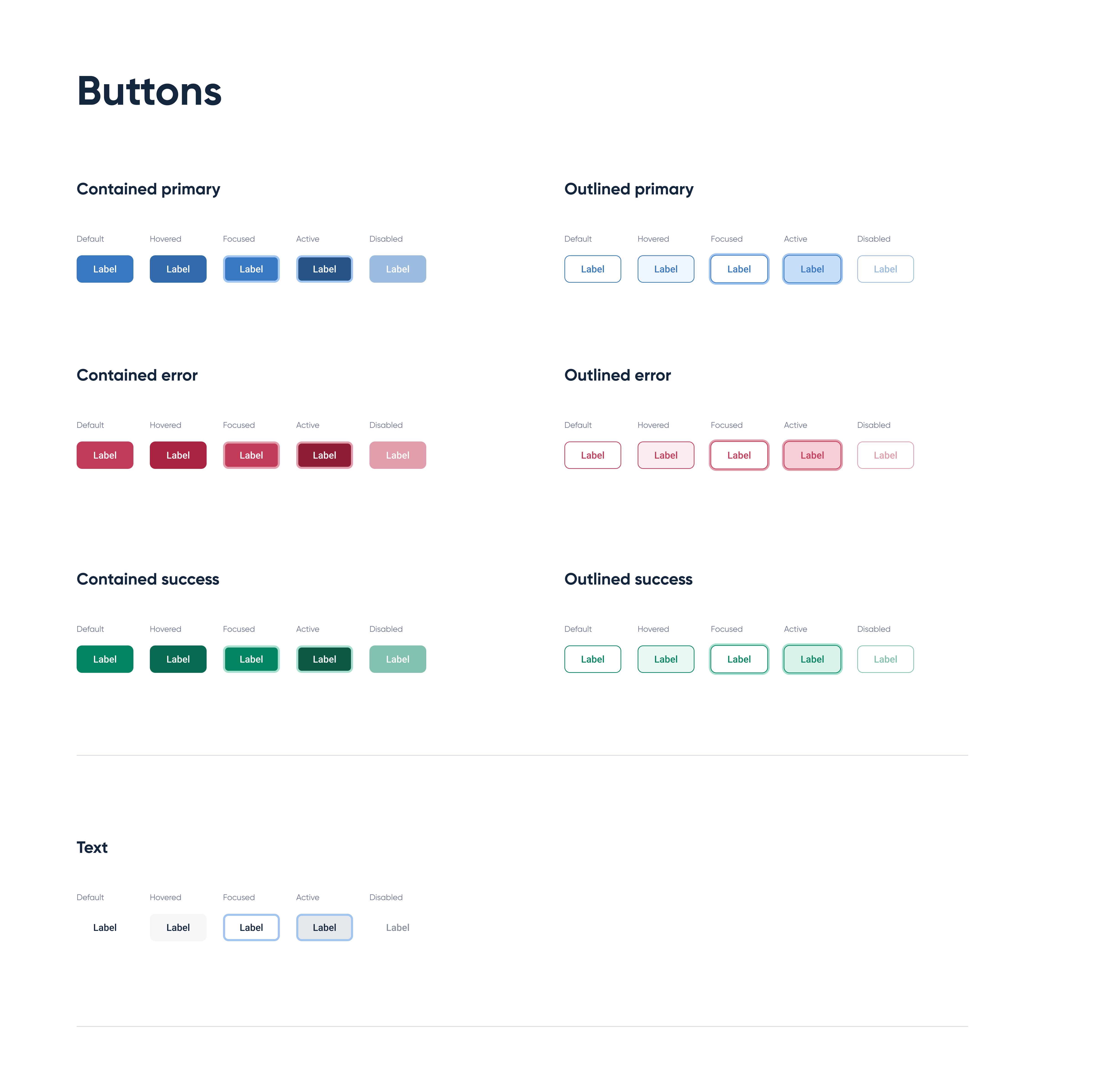
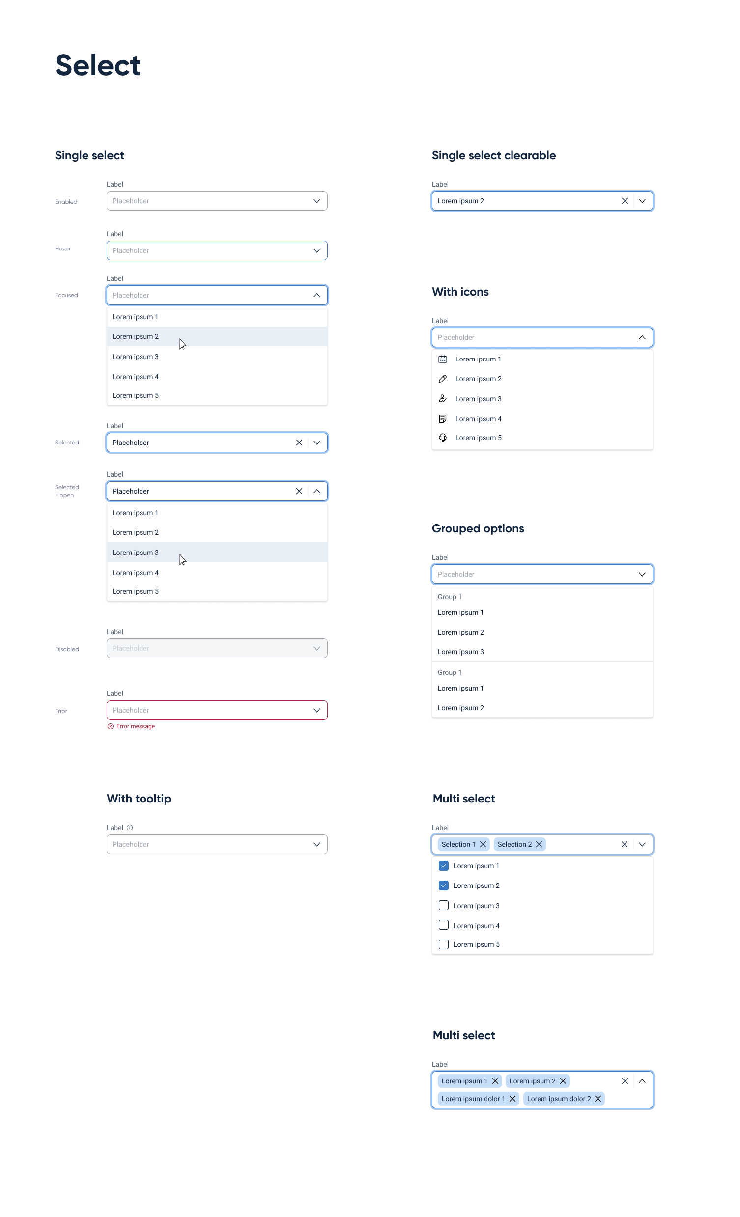
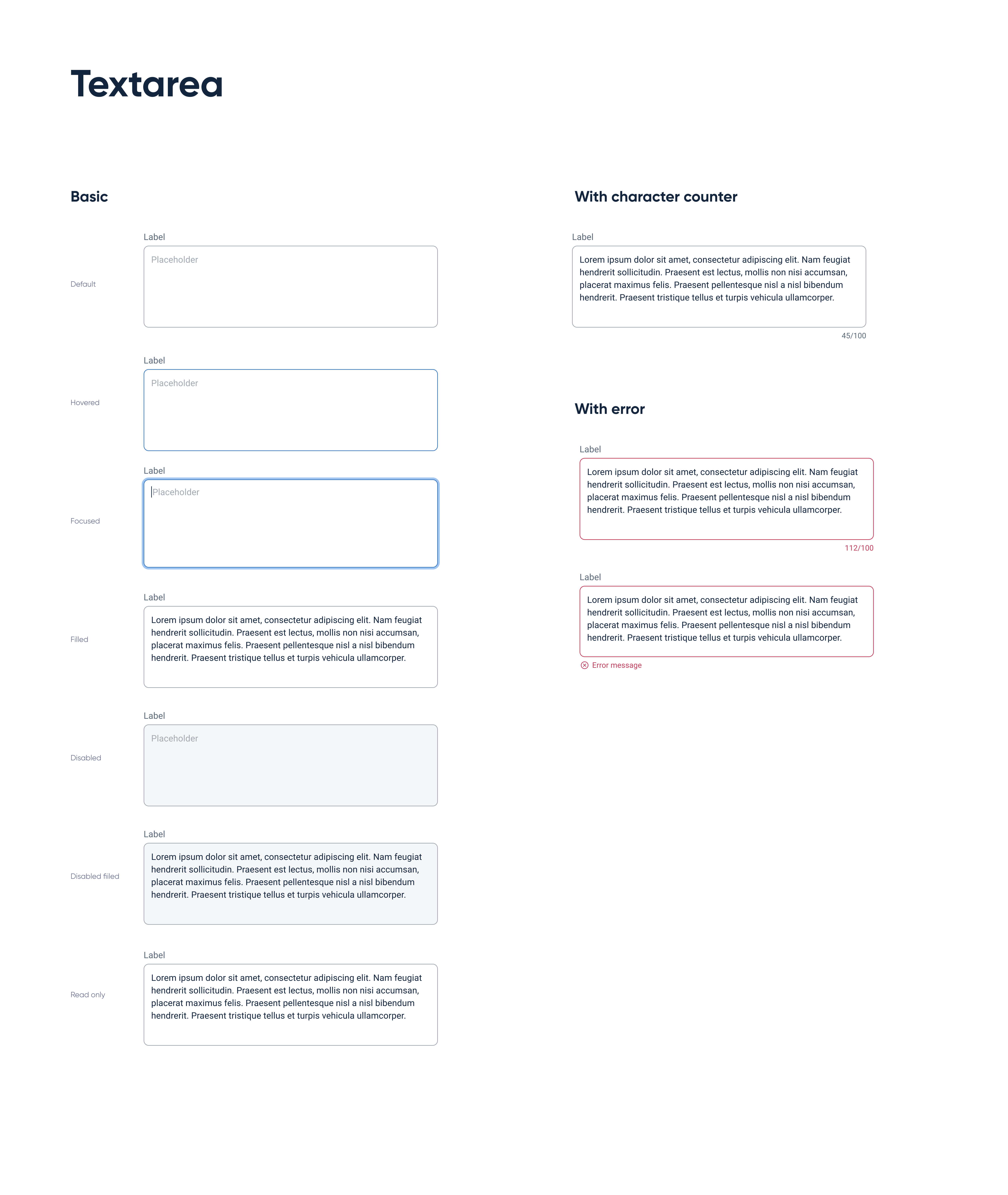
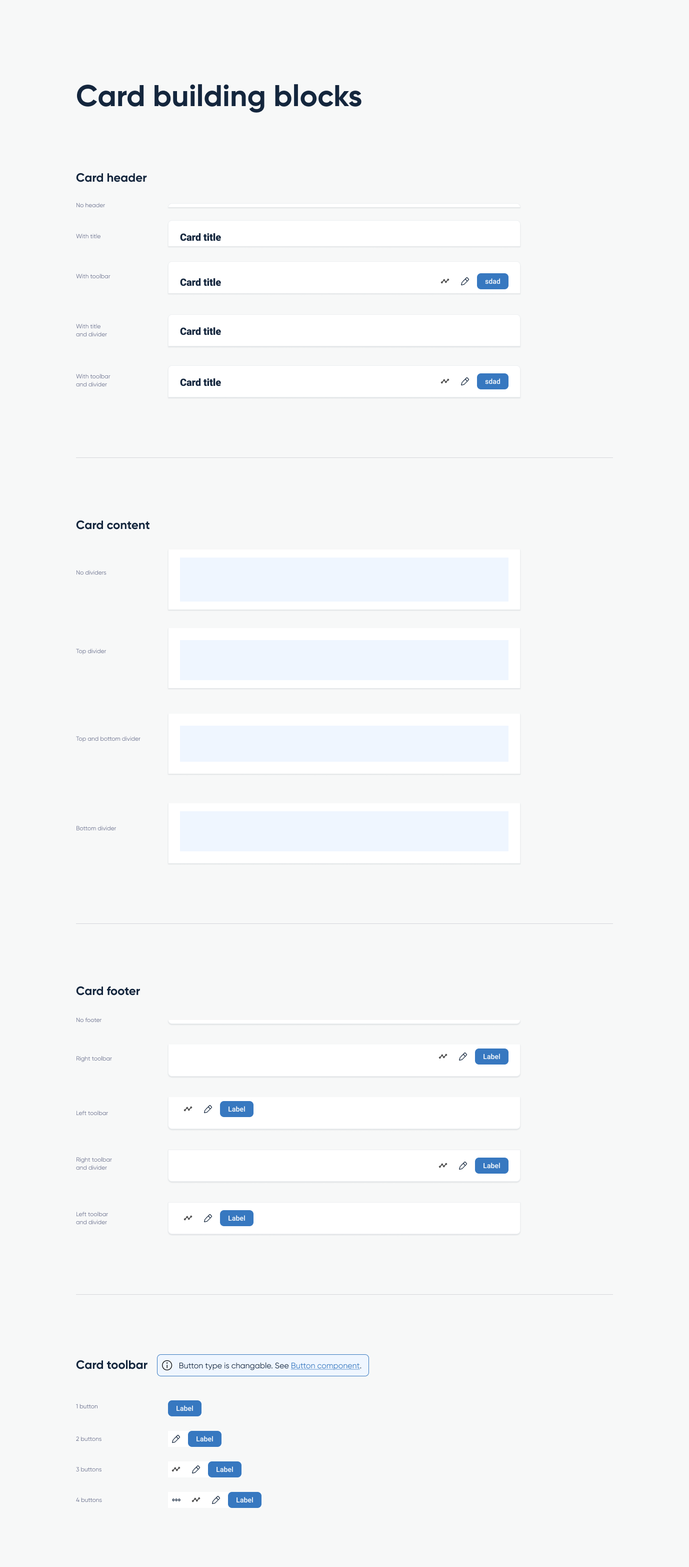
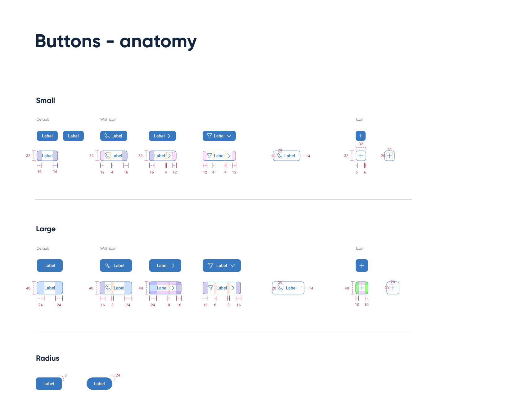
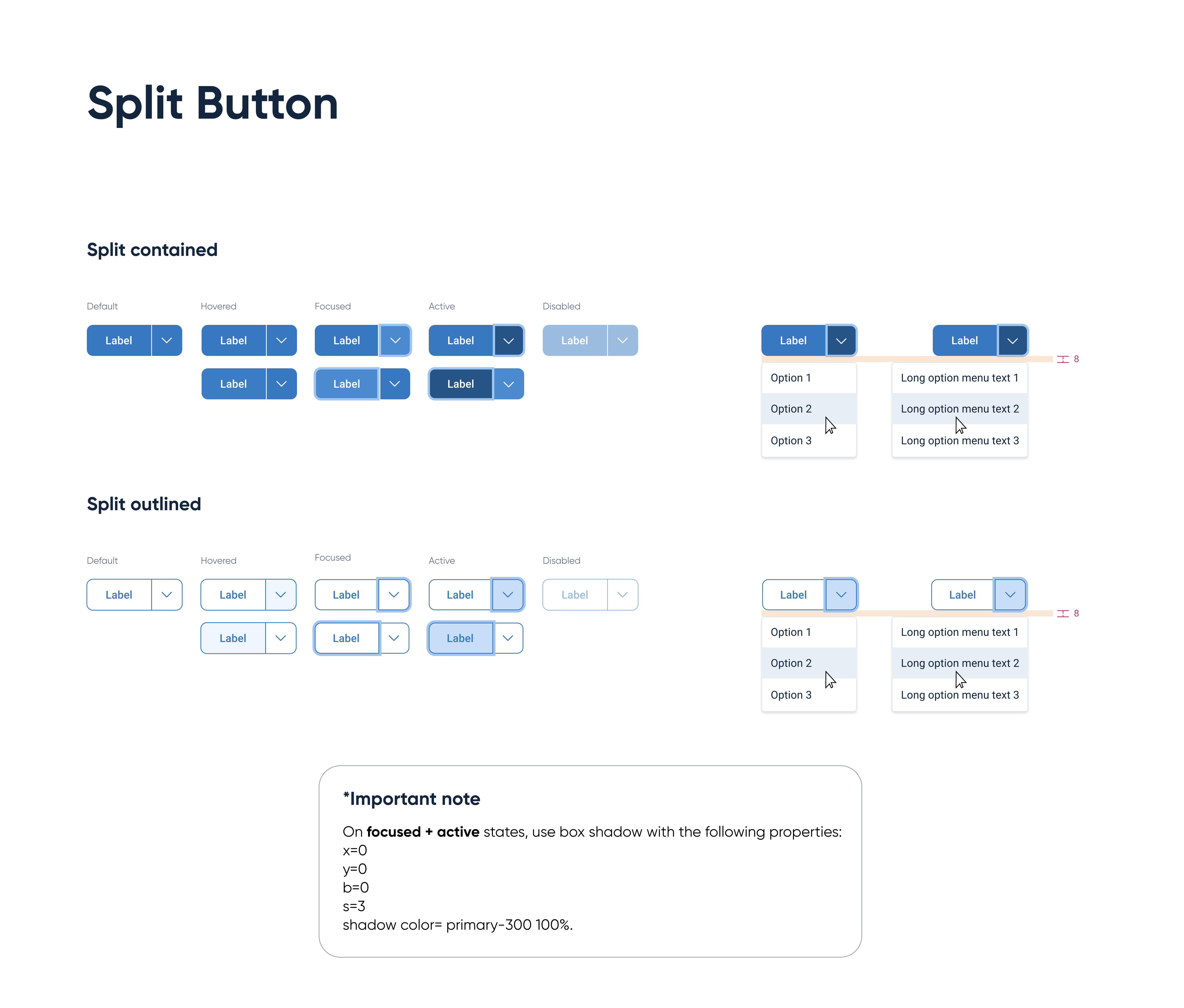
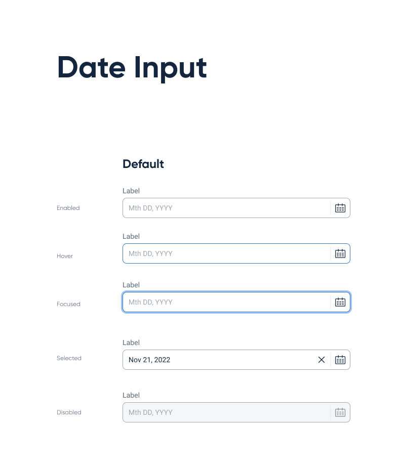
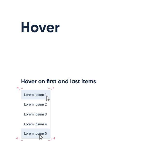
- Set guidelines - with each topic conclusion we created a clear styleguide demonstrating the various possible states.
- Create components in Figma - the last step before implementation, and the natural way for us to share components with each other, working on different products.
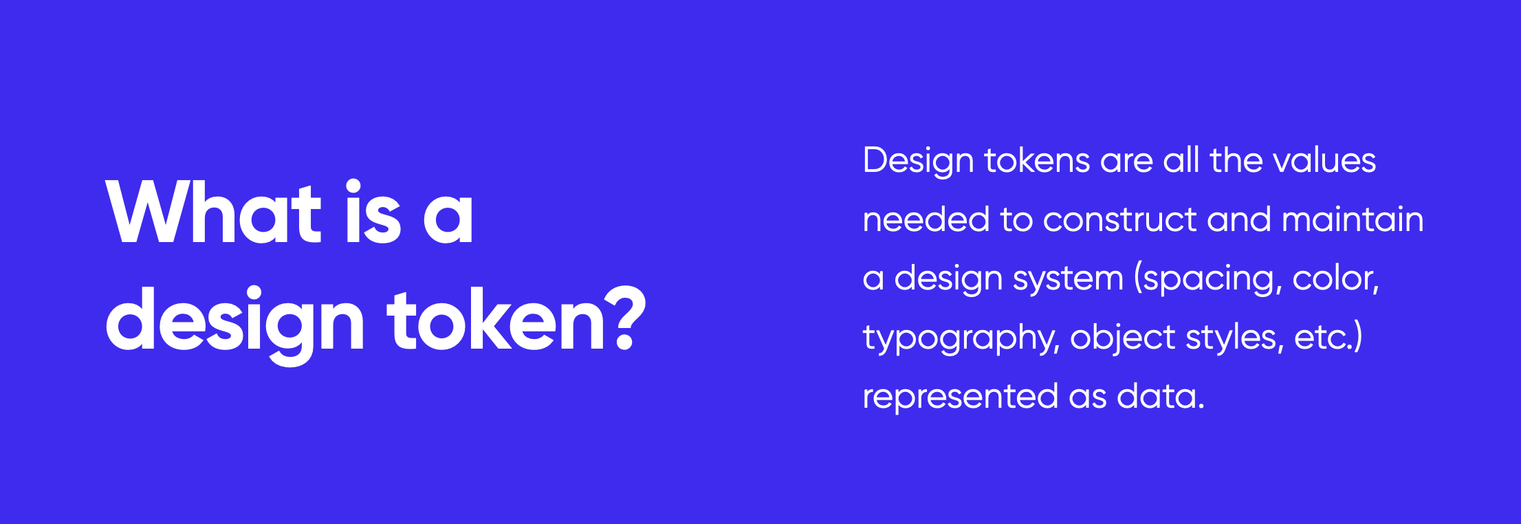
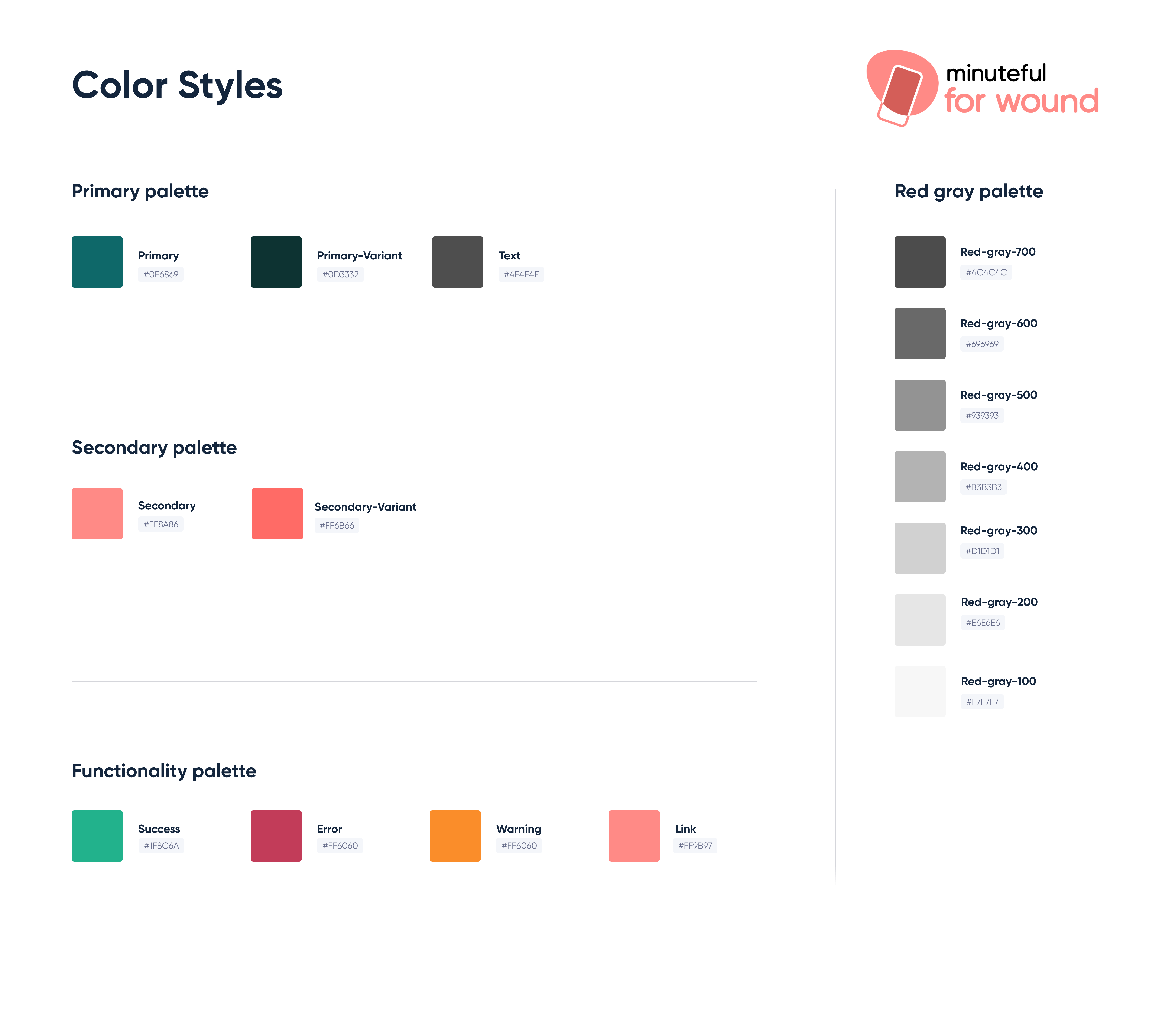
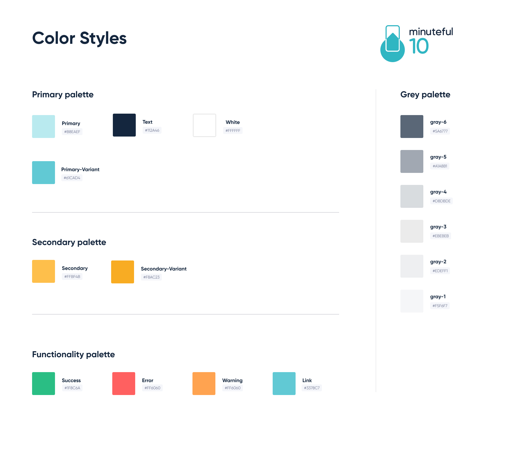
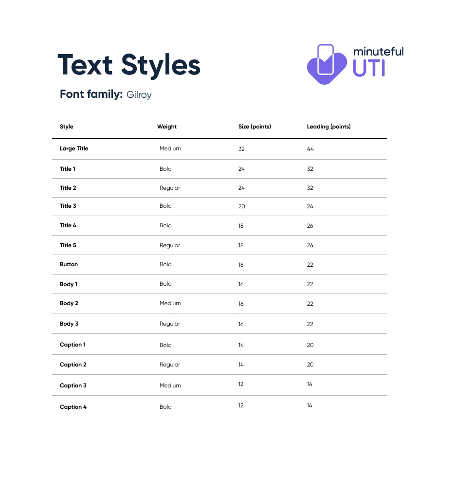
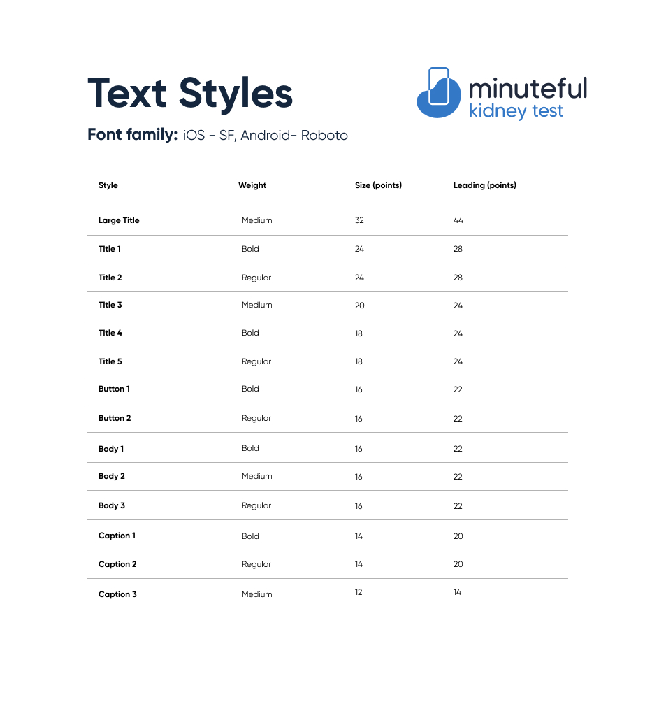
Foundations & tokens
We started with colors, and created a general color palette to be used by all of our products. The followed a naming convention which allowed each product domain to set its own primary, secondary and functionality colors. The same logic was applied to our typography and spacing guidelines.

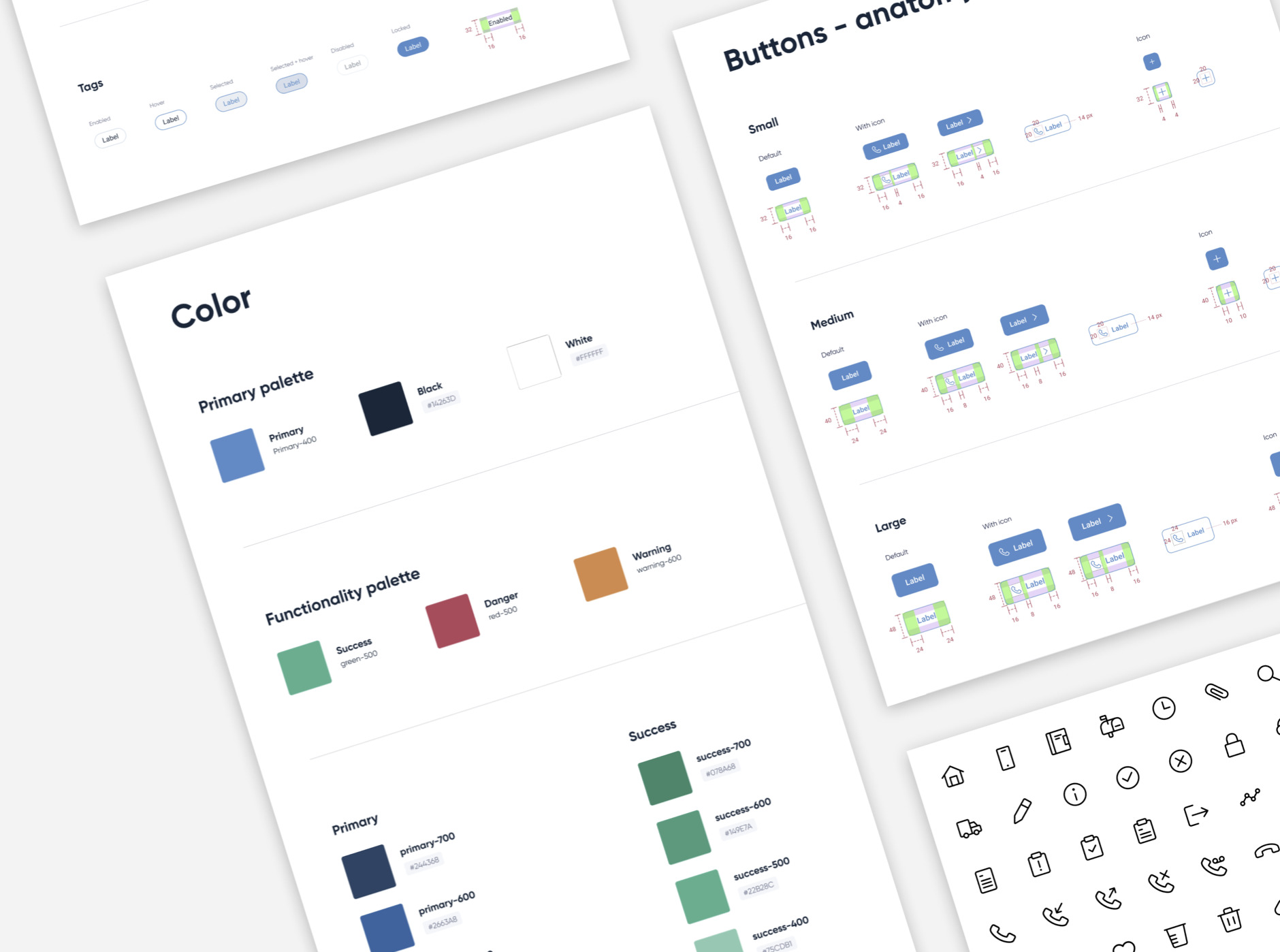
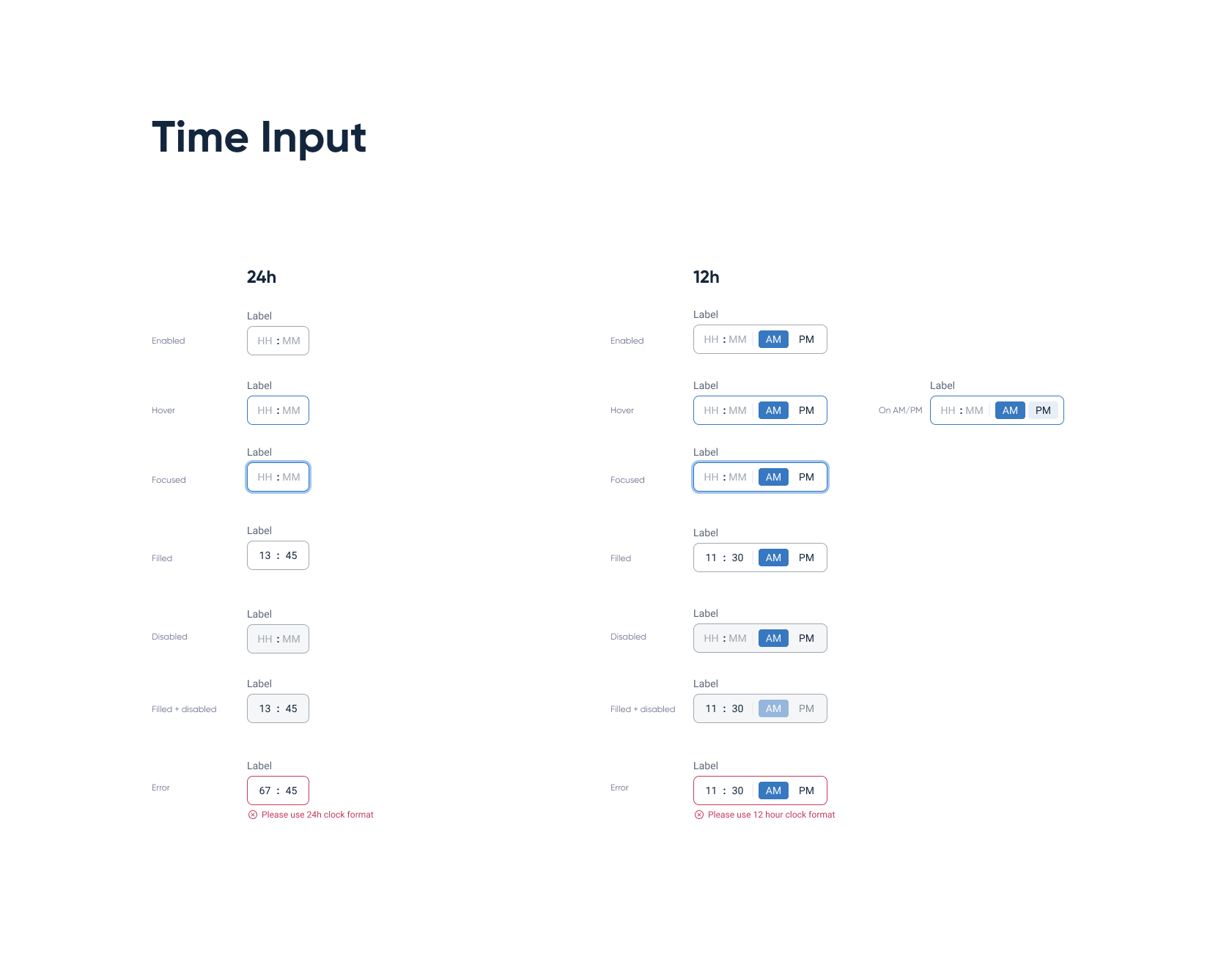
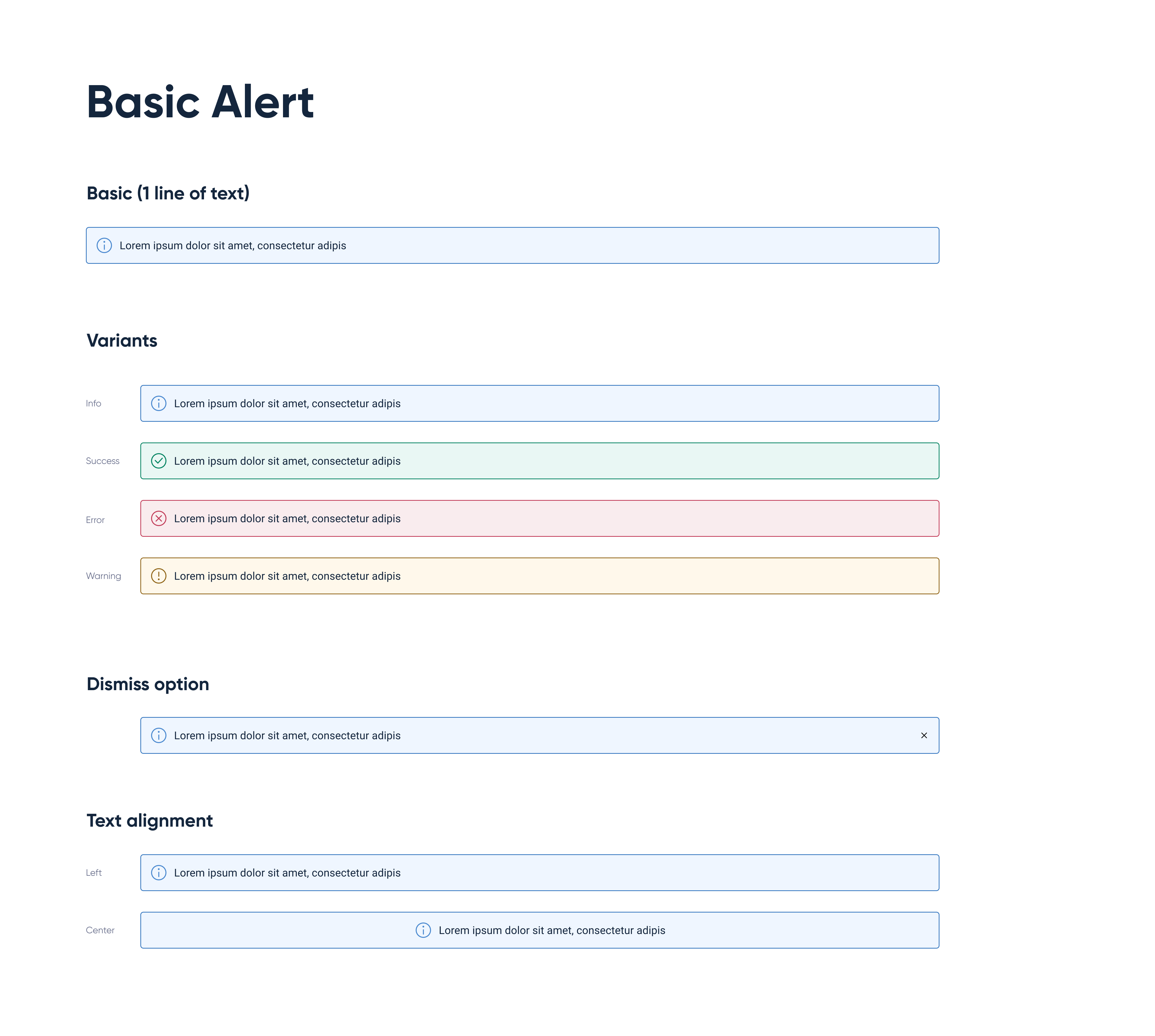
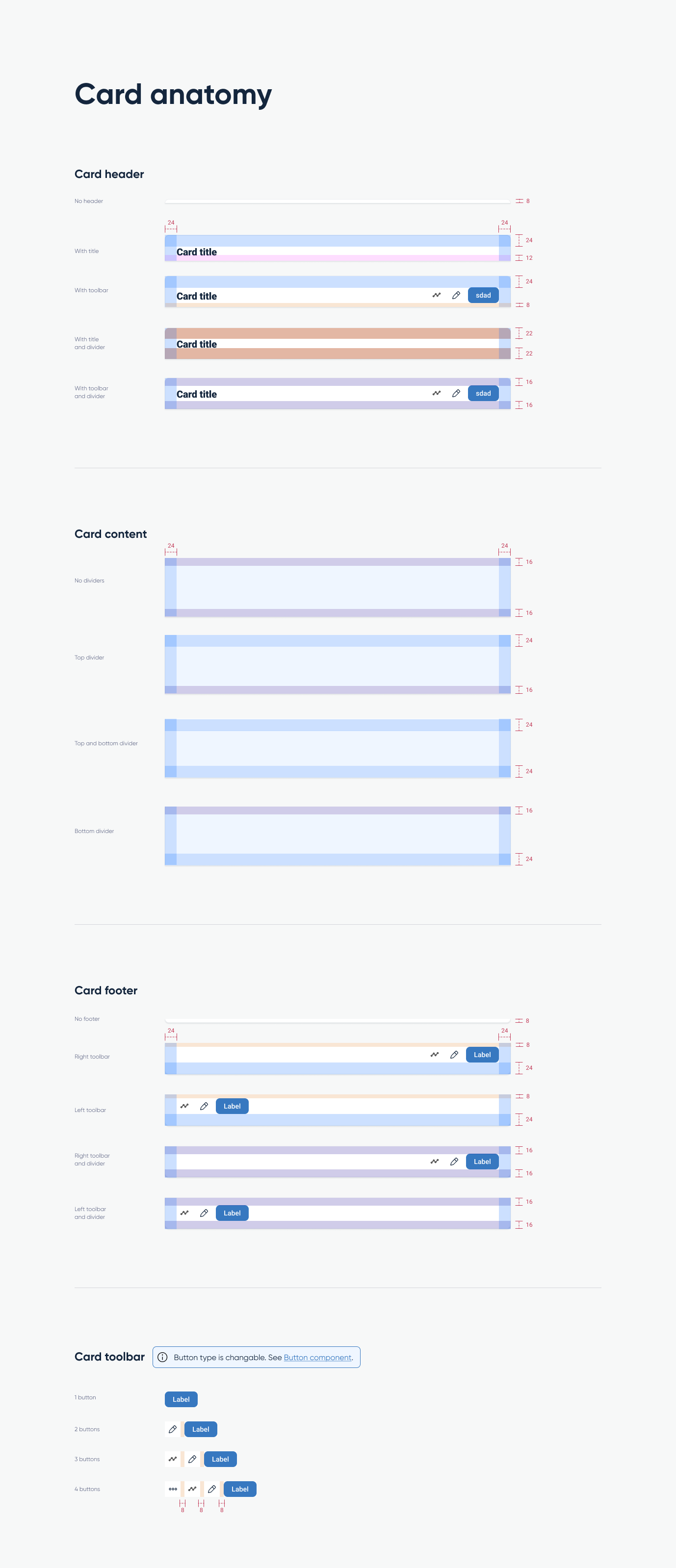
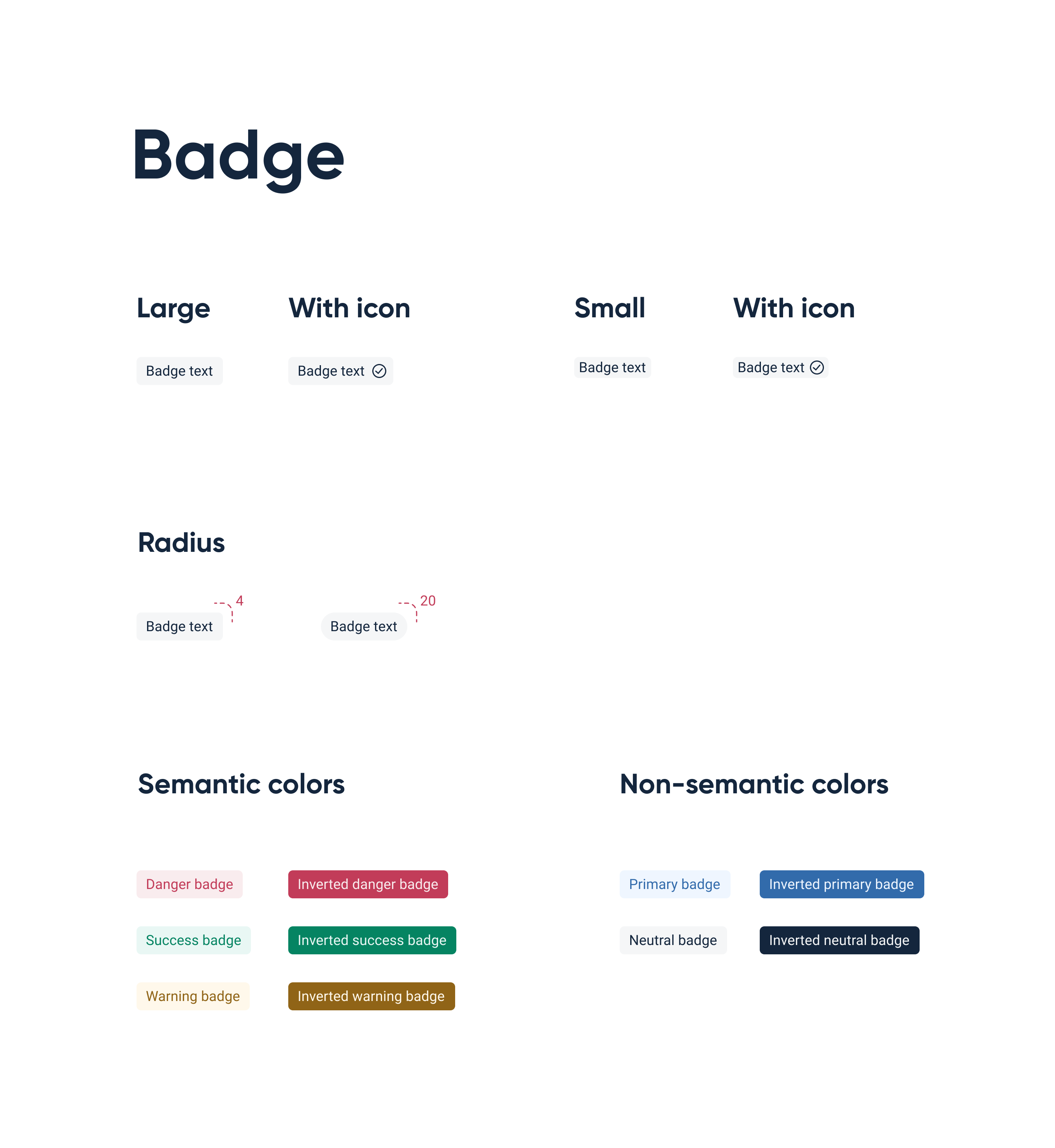
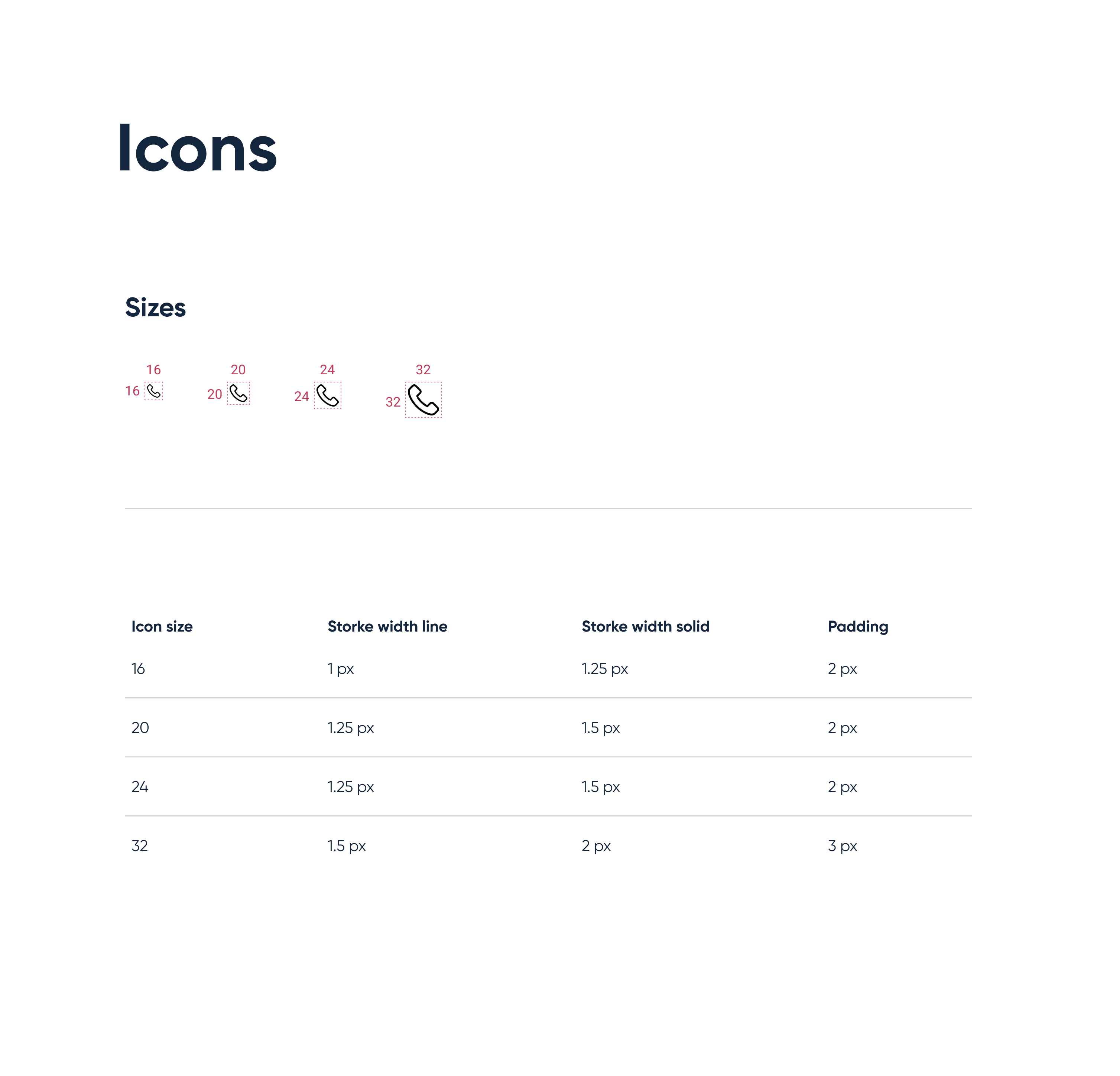
Components
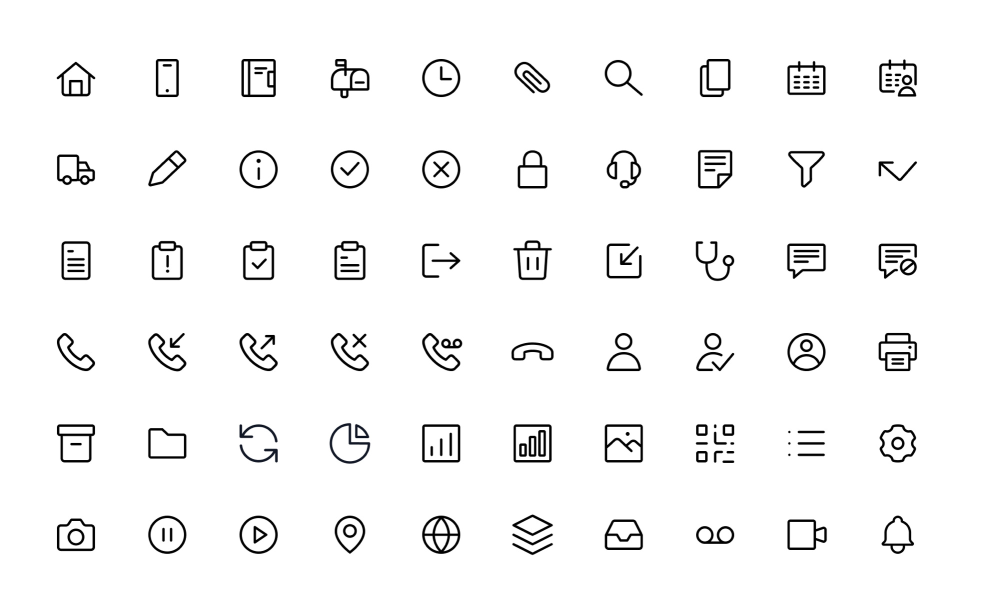
Once we laid the foundations we could tackle any component, from buttons to input fields, alerts, dialogs, icons, tables, badges and so much more.

